Introduction:
I always wondered why RED is considered powerful, signifies warning, or indicates an important event. Why not other colors?
To learn the history of red, read here. (You’ll get to know the fascinating story about it)
Colors do a lot more, studies say that 9 out of 10 times, the color of something influences whether we like it or not. It starts with the clothes we pick to the food we eat; it has a lot to do with our emotions.
Let’s learn more about how color psychology works particularly in marketing and branding.
What is Color Psychology?
It is a study that connects with human emotions and behavior. It have certain qualities that trigger human emotions.
“Colors affect people’s behavior, mood, and stress levels”
Colors are associated with specific emotions and it varies across cultures.
For example, white is associated with purity in one culture, whereas in the other culture, it symbolizes mourning.
Understanding color psychology provides value in fields like marketing, medicine, interior design, art, and much more.
How Color Psychology is Important in Branding and Marketing?
“Colors increase brand awareness by 80%.”
In marketing, colors communicate brand personality. Let’s delve into this to learn more about color psychology.
Brand Recognition
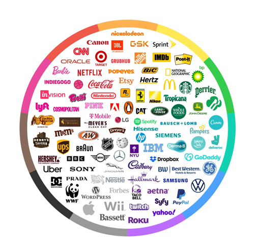
If you’re about to start a brand, the first thing you’ll do is “Logo Creation”, because visual recall is a powerful one for brand recognition. Logo color acts as the central hub of the brand’s identity.
Whether it’s the blues of Facebook or the different colors of Google, each brand has its own color pop. It’s not just about how it looks; it’s about creating a vibe that defines, “This is us!”. Those colors become your brand’s language.
So, the next time you see a color and instantly think of a brand, that’s how color psychology comes into the picture and then… The brand is recognized forever.
Personal Branding
Personal branding is a key player and it’s all about shining in the crowd. Your brand needs a signature color or a combination, whether it’s the calm blues that exude reliability or vibrant yellows that scream energy, your chosen colors become the visual representation of your brand.
Use the same set of colors across your online presence like business cards, brochures, banners and even in your attire.
People start associating those colors with you which builds trust and reliability in the process.

Below are a few examples showcasing how individuals use colors strategically to convey specific messages about their brand:
Netflix: Dynamic Red
Message: Red is associated with energy and excitement, and takes center stage in Netflix’s branding. It aligns with the platform’s bold, innovative, and thrilling content. Just as red captures attention and radiates confidence, its viewing experience will be as powerful as the color itself, cementing Netflix as a leading force in the entertainment industry.
Samsung: Blue and White
Message: Generally, Blue is associated with trust and reliability, and is coupled with white signifies simplicity and innovation. In Samsung, this color reflects the brand’s product and commitment to simplicity and innovation. This color combination is considered to be at the forefront of technological advancements in the industry.
Nikon: Yellow and Sleek Black
Message: Nikon, with yellow and sleek black, creates a powerful visual identity. Its color palette defines its photographic excellence with this color combination. Yellow signifies that a Nikon is ready to capture vibrant moments and black emphasizes the brand’s reliability and high-quality imaging.
For detailed color breakdowns, you can read them here.
A few Tips for Choosing a Color for Your Brand
1. Brand’s personality – If your brand personality is eco-friendly and sustainable, the choice of greens and natural browns works. Examples: Patagonia and The Body Shop.
2. Target audience – If your target audience is young enthusiasts, vibrant and playful colors may resonate. Examples: Nike, Snapchat, and Fanta.
3. Industry – If your industry is based on finance, colors like blues, deep greens, and muted gold works. Examples: Bank of America and Chase.
Consider these factors when choosing your brand color.
Conclusion
To sum up, the color chart is based only on research. However, the key to effective branding lies in aligning your color choices with your target audience’s preferences. You can run polls or surveys or approach them directly to get accurate insights.
It is not always about the specific color = a specific brand, it’s about understanding your audience’s preferences, which ultimately define your brand’s longevity. They are the driving force behind your brand’s success.
Happy branding!!!
PS: Do you know why Instagram Marketing is important for businesses? Read here.
